A landing page for clients and ethical hackers seeking penetration testing, bug bounty programs, and vulnerability disclosure services.
Type
Web Application
Role
Senior Product Designer
Web Developer
Tools
Figma
Photoshop
NextJS
Timeline
Winter 2023
Duration: 3 Months
The Problem
How might we redesign our landing page to better align with our branding, show the value of our services, and increase engagement for both outbound clients and ethical hackers?
Research
Empathizing with users
To know how our product can stand out, I conducted a competitive audit on local and international cybersecurity platforms like HackerOne, Bugcrowd, and Synack.
By analyzing their website and brand book, I took note of all the recurring sections used and how they presented their services to both clients and ethical hackers. I found that most platforms focused first on clients and then on hackers. Using this insight, I created the content of our landing page, which primarily focused on marketing the product to potential clients. I then designed a separate page dedicated to ethical hackers, who are also part of our target market.
Competitive audit of existing cybersecurity platforms
I also identified user pain points while conducting the competitive audit. For example, I noticed that certain platforms make it hard for hackers to join their platform. With this pain point in mind, I made sure to include a call-to-action button in our navigation bar to make it easier for both hackers and potential clients to sign-up.
Ideation
Brainstorming solutions
To help organize the flow and structure of my design, I created a sitemap with the elements and hierarchy in place. This is crucial for organizing the content on the landing page and ensuring clear navigation, so the user intuitively understands where to find the information they want.
Using the insights from my research, I identified and noted the essential pages, sections, and elements that would best attract users in my sitemap. The audit also revealed common practices and gaps in competitor platforms, which helped me refine our sitemap and design a landing page that is intuitive, addresses user pain points, and enhances overall site functionality.
Sitemap of Secuna's Landing Page
Branding
Typography, Colors, Logo, etc.
I identified the need for a consistent brand identity as soon as I joined Secuna. I immediately noticed varying shades of blue in the old platform, which made the visual identity feel inconsistent. With the invaluable two-month mentorship of my senior, Emman (best mentor ever!), I created a cohesive brand book for our cybersecurity platform.
Since clients rely on us for security, it was essential that both the visual identity and language reflect reliability. To achieve a more distinct, trustworthy, and elegant feel, I chose Proxima Nova as the primary font, moving away from Inter, which is commonly used in SaaS products.
For the color, I used the old logo’s colors as the starting point. From there, I created a palette with shades of blue and grey that aligned with the brand's message of trustworthiness and security. We decided to keep the old logo to honor the old design. This decision also ensures that former clients still recognize the Secuna brand and the updated identity feels fresh yet familiar—building on the trust we had already established.
Brand book of Secuna
Redesign
Design and Development Process
While our platform redevelopment was still ongoing, the CEO tasked me with revamping our landing website to align with the current brand identity.
With the CEO aiming for a Q1 2023 launch, we had to act quickly. We decided on an MVP approach—using Webflow to build a one-page design in under two weeks. Although my initial suggestion was to use Next.js, the tight deadlines made this impossible. Once we had more time, I revisited the idea and coded the final site using Next.js, TailwindCSS, and Tailgrids.
The project scope evolved as the CEO continued to request additional pages. Over the course of three months, I designed and developed all the finished pages, while also training our interns in both design and engineering.
Different versions of the Secuna Website
Product Showcase
The solution
Landing Page
This page is the first one that users interact with on the website, so a bold hero section that highlights clients and key metrics is a must. It also includes our value proposition, like features, benefits, testimonials, services, and certifications, while always guiding users towards a call-to-action (CTA) to either register or contact Secuna.
Who We Are
To showcase the company's reliability and commitment to security, this page shows Secuna’s history, principles, standards, regulations, mission, and values. It also highlights the vetting process for ethical hackers.
Cybersecurity Solutions
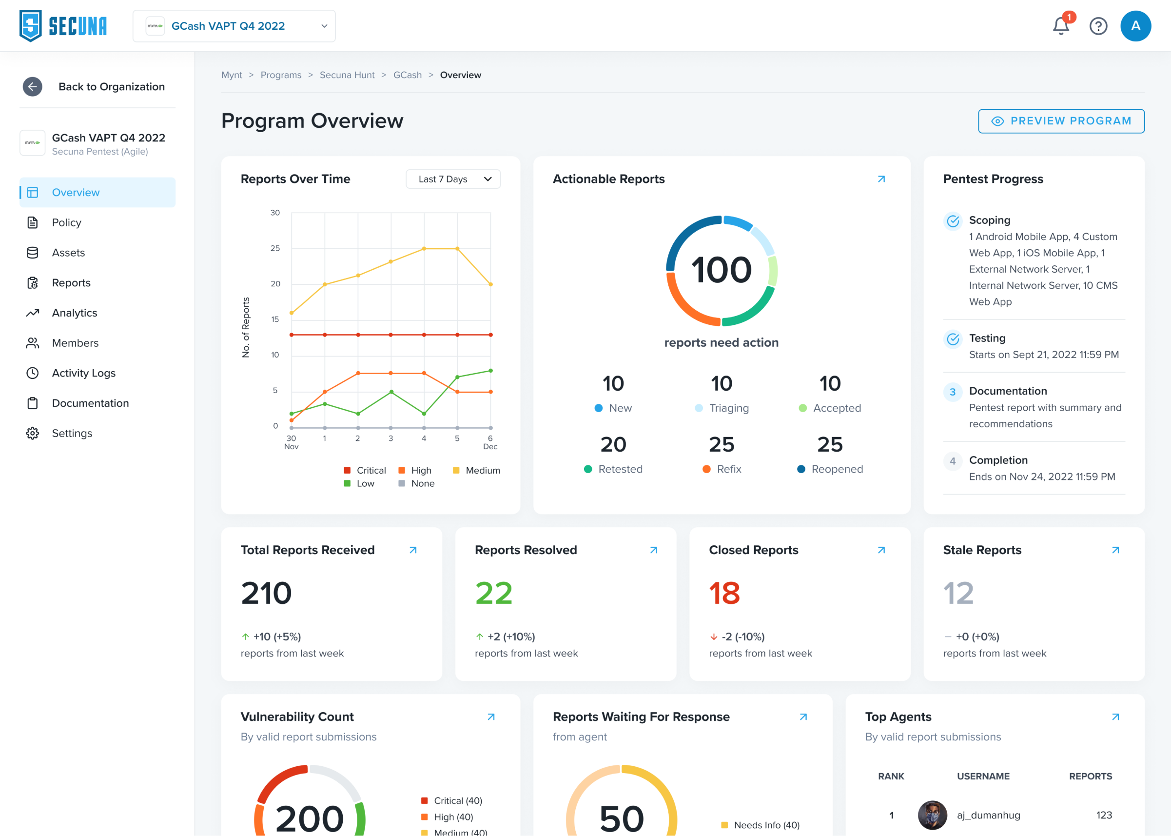
These pages show Secuna’s cybersecurity services, like the different types of Secuna Pentest (VAPT), Secuna Response (VDP), and Secuna Hunt (Bug Bounty Program). Each service has its own page, where it outlines how the service works, benefits, use cases, and pricing.
Document Verification
The document verification feature allows our clients to verify our Secuna-issued documents online.
Hunter
This page is dedicated to entice ethical hackers to join Secuna. Aside from that, this page serves to answer common questions that a hacker might have before signing up on our platform.
Contact Us
The contact page contains a contact form and contact details to allow users to get in touch with Secuna for inquiries about our products if they are still undecided customers or for support.
Results
Data analysis
Contact Page Data Analytics Overview from June 2021 - December 2024 (No Labels to Protect Company Data)
As of December 3, 2024, here are some insights from our contact page:
71.79% increase in pentest service interest after the website redesign
272.73% growth in pentest requests per year from the old website to the new website
2021 to 2022: 100% increase in pentest requests
2022 to 2023: 45.45% increase in pentest requests
2023 to 2024: 28.13% increase in pentest requests
32.34% of form submissions occur in the morning, with the highest at 51.50% during the afternoon
263.95% increase in contact page views after launching the new website
Key Insight
There is a significant impact on business outcomes and user engagement, as seen in the 272.73% growth in pentest requests per year after the website redesign. This demonstrates the impact of the design and cohesive branding to attract potential clients looking for penetration testing services. The 263.95% increase in contact views also emphasizes how creating a good call to action and marketable product content boosted engagement, leading to more inquiries and potential conversions.